Peter Owen and Keith Cunningham made a good team. After a spell learning the ropes with other publishing firms, the former had set up shop trading under his own name in 1951. Owen set out his cosmopolitan stall with books such as a biography of Colette, an autobiography by Henry Miller and translations of Julien Gracq, Cesare Pavese and the esoteric Comte de Lautréamont. Muriel Spark worked for the firm for a spell.
Keith Cunningham came along later. Born in Sydney in 1929, he had come to London to study art just after the Second World War, started to make a name for himself, been praised in the press and invited to join the London Group — then given it all up for reasons he kept to himself. (After his death, Apollo magazine dubbed Cunningham “the artist who walked away from fame”.)
Fortunately, he found work with Peter Owen. And what work the best of it was: distinctive, stylish, economical. It had to be economical, in fact, in the non-artistic sense. “We had very little money”, Owen recalls in his memoirs, “but, from 1963 onwards, Keith managed to produce some striking and elegant graphic designs for us, often using just two colours.” These designs were a world away from Cunningham’s Goya-esque oil paintings. He used found imagery or made photograms, throughout the 1960s, to create book jackets equal in quality to those of contemporaries such as Romek Marber and Paul Bacon. (Another maestro of the period I only recently discovered: Anita Klinz.)
The photographic jackets of the seven volumes of the Journals of Anaïs Nin (1966—80) are Cunningham’s, I believe, as are some bold designs for the novels of Hermann Hesse. The front of the jacket for The Gemini (1964), Meg Elizabeth Atkins’s debut novel, features cut-out twin figures, linked but suggestively differentiated by colour scheme. A foot in a red high-heeled shoe fills the same space on Jane Bowles’s Plain Pleasures (1966), lying down rather than standing up — a deadpan hint in the direction of trouble.
Many Peter Owen titles of the 1950s look adequate to my eye, but only a handful of them stand out. From a design point of view, the 1960s (into the mid-1970s) seems to mark the high point for the firm, as I guess it was for some other publishers. Design Week considers it a “special period” for Cunningham, during which “financial constraints” didn’t stop him producing book jackets of “great simplicity and effectiveness”. If his later work remains simple and effective without being as striking or memorable, it may be down to “the pressures of change in the marketplace”.
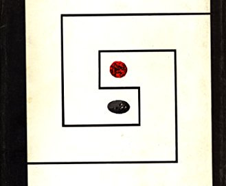
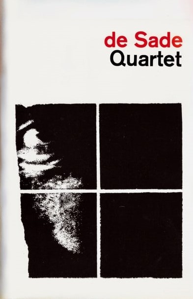
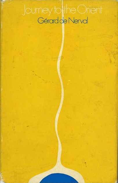
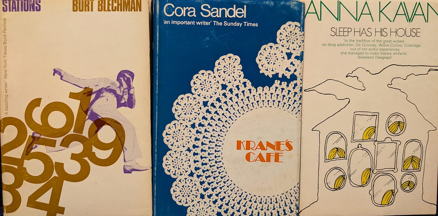
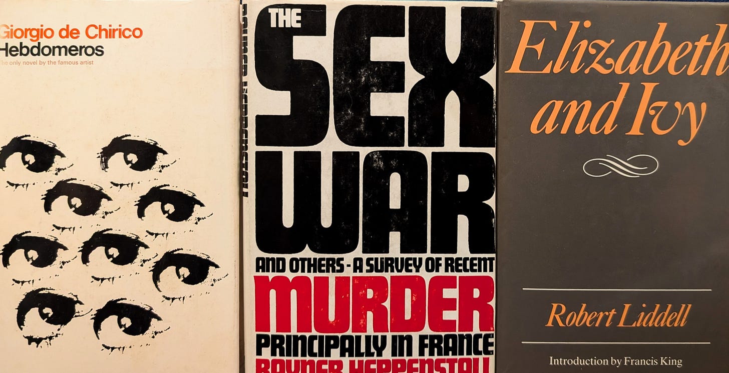
Pictured below are some Owen/Cunningham titles from my own shelves, alongside a few others, serving as a reminder of the quality of Owen’s back-list. (Ryunosuke Akutagawa, Paul Bowles, Blaise Cendrars, Colette again, Anna Kavan . . .) Several cost only a few pounds. I’m not avidly pursuing more — or fretting, in this case, about their condition — but it’s an occasional pleasure to pick up a volume, if one happens to come my way, every now and then. While kidding myself that I can now spot a Cunningham jacket at a distance. The budget won’t stretch to The Lolly-Madonna War (1969), a non-detective novel by Sue Grafton, or Yoko Ono’s Grapefruit (1970). But there are plenty of others out there. (How prolific a publisher Peter Owen was in his day; he died in 2016, and the company was bought by Pushkin Press three years ago.)
One day, yes, one day, I will bump into a near-fine copy of Nin’s critical study The Novel of the Future (1969), surely . . .

