


The art of the book, 1938

This comes a week late, but April 2 is a significant date in book history: it marks the anniversary of Jan Tschichold’s birth, in 1902.
Tschichold being the German type and book designer who produced the influential modernist manifesto Die neue Typographie in 1928 — then repudiating that manifesto and going on, in the late 1940s, to reform the established formula for a Penguin paperback (if anything, an even more influential achievement).
Tschichold’s name comes up only once in a certain volume on a related theme published between these two high points in his career, in 1938: The Art of the Book by Bernard H. Newdigate. This is a “special autumn number” of The Studio, the magazine of “fine and applied art” established in 1893, and a sequel of sorts to previous Studio specials on the same subject — The Art of the Book (1914) and Modern Book Production (1928). It’s also something of a time capsule. While providing some enduring lessons for book designers (or so I imagine), it happens to offer some guidance on what to expect of books produced in the early twentieth century, in all their variety and ingenuity. I recently picked up a copy of The Art of the Book for £15, and, despite the mottled endpapers, already regard it as a wondrous bargain.
Newdigate had contributed to those two earlier Studio books about books; as a contributor on book production to the London Mercury, he had also clashed with Bernard Shaw over eccentric Shavian printing preferences. Newdigate knew his stuff, even if not everybody agreed with it. As the esteemed scholar-printer of the Shakespeare Head Press in Oxford, Newdigate both wrote and printed the 1938 Art of the Book. He begins by asking if there really such a thing as an “art” of book-production — and answers, as expected, in the affirmative. This is an art with many components (type design, paper and ink, as well as the modern “ancillary crafts” of lithography, photography etc) that combine to produce, ideally, a book that may be read “with ease, with comfort and with pleasure”.
What did this scholar-printer make of the sainted Tschichold? Not much, it seems. Tschichold is merely mentioned in one of Newdigate’s opinionated captions as a proponent of “functional typography” (with “everything reduced to elemental essentials”). For the Penrose Annual (another periodical about the graphic arts), also for 1938, Tschichold had “deliberately reversed tradition by making the inner margin wider than either the head-margin of that of the fore-edge”. In other words, if you opened the Penrose Annual to look at two facing pages, you would be looking at two blocks of text (one on each page) with a large white space in the middle and smaller white spaces both above them and framing them. Heresy!
I’m not sure Newdigate’s opinion on Tschichold here can be put down to knee-jerk conservatism. Certain well-examined aesthetic and pragmatic principles (albeit debatable ones) inform Newdigate’s views. Always before him is the example of William Morris, whose Kelmscott Press helped to instigate the fine press movement of the late nineteenth century. And when it came to laying out the page of a book, Morris’s rule was to make “the inner margin the narrowest, the top somewhat wider, the outsider wider still, and the bottom widest of all”. At the same time, Newdigate can cite “reasons of convenience” that long predate Morris: the outer margins of even “very early books” were “used for notes, as indeed they are sometimes used nowadays, and they are those most usually covered or gripped by the reader’s hand”. Margins’ exact width matters less than their proportions and their practicality. And the “divorce” between Tschichold’s facing pages, Newdigate argues, “confirms the justice of Morris’s rule that the unit of a book is not one but a pair of pages”.
This is not to say that Newdigate was right and Tschichold wrong, and that’s that. The latter was, for one thing, a moving target, capable of a radical rethinking of his principles, as mentioned above. For another, this very minor skirmish in the margins of book design might be said simply to betoken a healthy sense of the relation of woods to trees, and vice versa. It matters less, I suspect, that Morris was far from being everyone’s cup of tea by 1938,1 than that every element of book design had to be balanced by the others. An obvious lesson, maybe, but not one that every book designer seems to have taken to heart.
Newdigate can be a touch melodramatic about such matters. The page of a book “may repel, if carelessly composed and printed”, he warns. But I find his show of caring deeply for his work to be easy enough to forgive. Book art is an art of minutiae, as Newdigate takes for granted, but minutiae that must find their place in a grander scheme. Type aficionados may go into raptures over ligatures, kerning etc — Newdigate remains coolly unraptured. “The way in which the type is used . . . matters even more than the character of the face.” The swipe at Tschichold seems to be consistent with this holistic approach to the art of the book.
This is a volume about that art, meanwhile, written in a moment of crisis. For in 1938, the world was soon to go war (as when the 1914 Art of the Book was published);2 labelled a “cultural Bolshevist” by the Nazis, Tschichold had, only a few years previously, escaped Germany and spent some time in England. And the multifaceted art described by Newdigate had already been cut off from the past by the crisis of the financial crash of 1931 and the Great Depression. With this disaster, “the demand for fine and costly editions”, as produced in the storied past by presses such as the Kelmscott, Ashendene, Doves et al, “suddenly ceased”.
Yet the aspiration to produce good-looking books hadn’t gone away. Newdigate looks back to 1928, when the editor of the The Studio could describe dust-jackets as “a novel feature”, and compares that novelty to the profusion of jackets a decade on. It is a development he welcomes. “The jacket has done more than anything else to give the bookshop window its modern aspect of gaiety.”
Nor is Newdigate only interested in “fine work” for connoisseurs who can still afford it. The Penguin Illustrated Classic edition of Robert Browning’s Selected Poems (1938), for example, with wood-engravings by Iain Macnab and text set in Times New Roman, seems to him “a triumph of cheap production”, and he goes on to praise Penguins paperbacks in general terms for “the handy form, the delightful get-up, the readable type”. (This is all before Tschichold got stuck in.) All that constitutes an achievement that the unfashionable Morris himself might have admired.
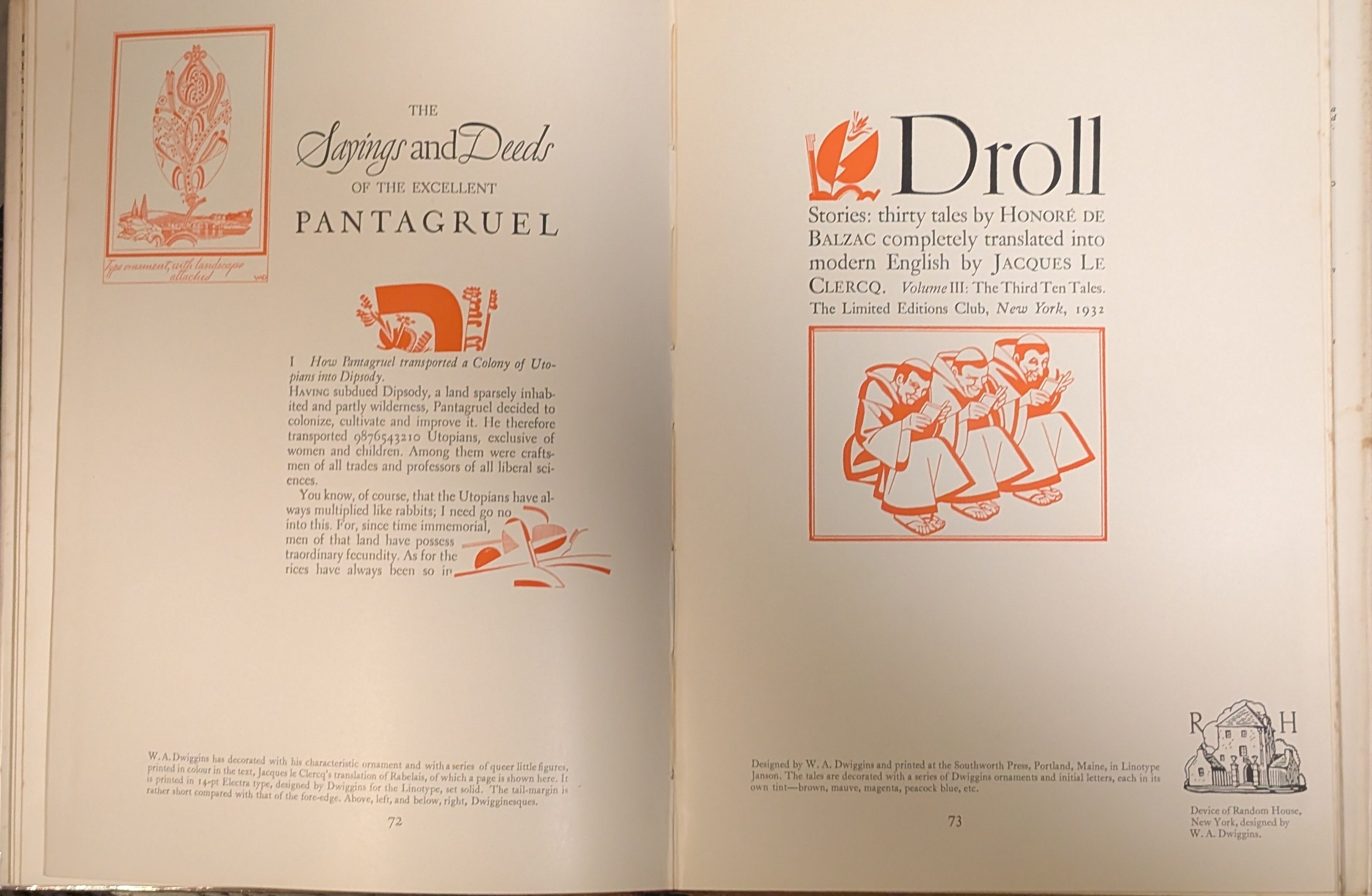
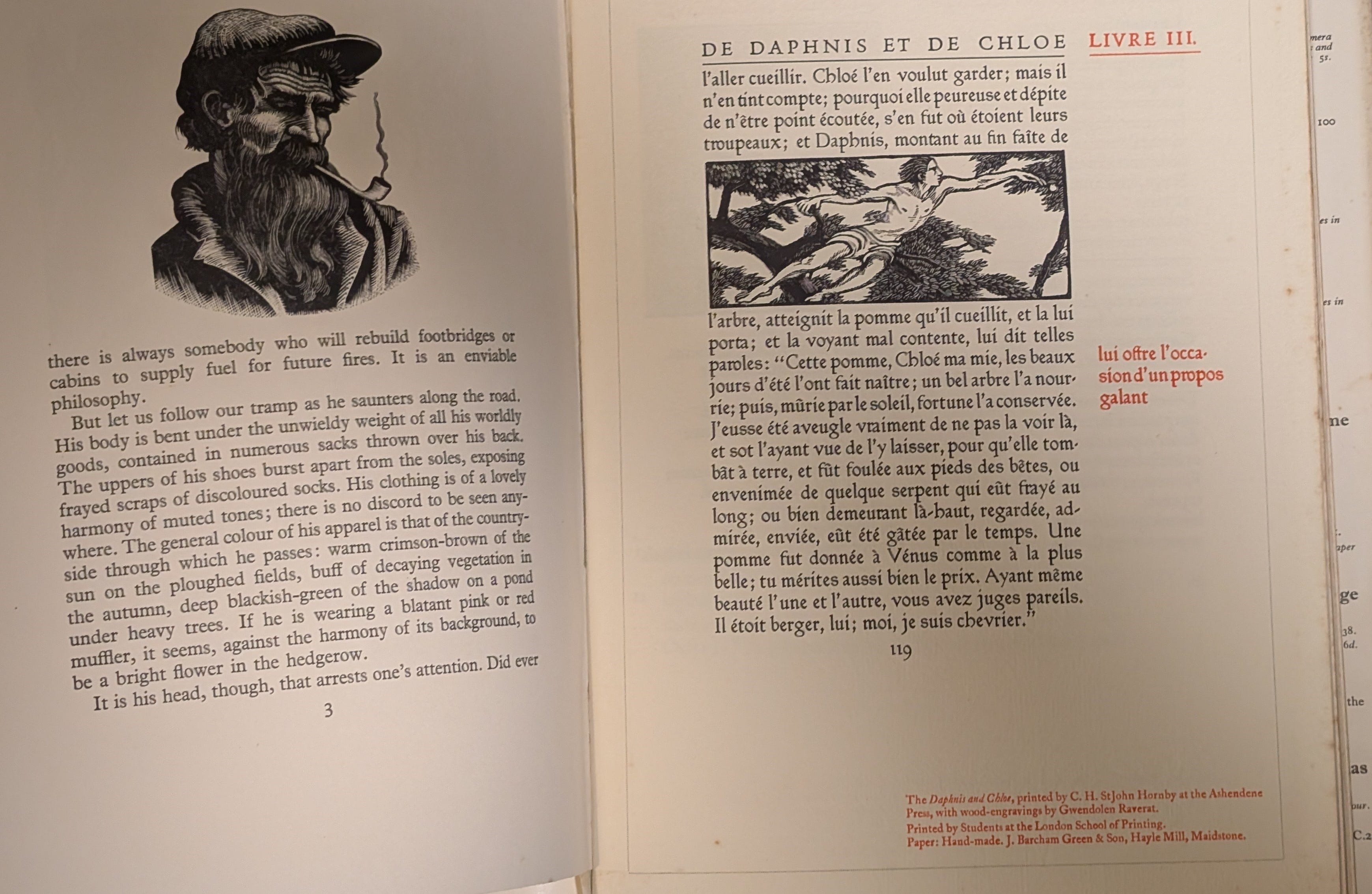
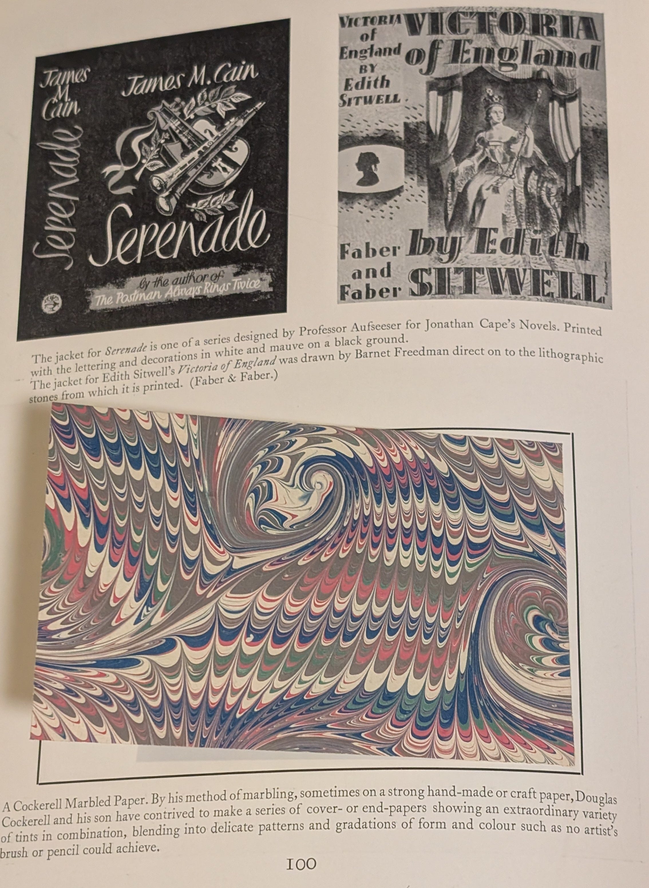
You can find The Art of the Book, in both its 1914 and 1938 incarnations, online. The same goes for Modern Book Production. It’s useful to have them around in that form, but nothing like the real thing (at least in the case of 1938). For the volume’s dominant feature isn’t Newdigate’s prose or (even then) outdated opinions but, as he admits at the outset, its numerous reproductions of pages from books “printed within the last decade”. This gallery of notable books is augmented by a scattering of inset pages, including a fold-out page from the “magnificent” Oxford Lectern Bible, allowing the reader to appreciate different presses’ choices of paper, ink and design. It’s an immersive, tactile experience, to which the online version of the book, at least the one I’ve seen, cannot possibly do justice.
ICYMI: Professor Leah Price of Rutgers University is giving this year’s Lyell Lectures on “Victorian Books and Their Servants”; her subjects, beginning on April 29, include “how rich and poor readers pictured one another” and “the angel in the library”. Blackwell’s Rare Books publishes the twelfth and final catalogue in its Modernisms series this month; the first item listed here is a copy of the American first edition of Mulk Raj Anand’s novel Untouchable (New York: Wishart, 1935; £2,000) and the last is On the Boiler, a hotchpotch by W. B. Yeats (Dublin: Cuala Press, 1938; £200), of which the first printing was mostly destroyed by the poet’s wife.
See William S. Peterson, The Kelmscott Press: A history of William Morris's typographical adventure (Berkeley: University of California Press, 1991), 292ff. Newdigate is identified here as a hold-out against the general anti-Morris trend.
“1914 was also the year of the great Exhibition of the Graphic Arts at Leipzig. I well remember how when I visited the Exhibition in July of that year, I seemed to see in the German Pavilions the hand of [the British calligrapher Edward] Johnston on every stall and every wall . . . A fortnight later the world plunged into war.” Bernard H. Newdigate, The Art of the Book (London and New York: The Studio, 1938), 5.